In today’s Q & Cake (our own fancy version of Q & A) Elisabeth and Holly discuss several questions from listeners about choosing client gifts, creating refund policies for commissioned work, and the ethics and pricing strategy behind liscensing custom work. They’re also chatting about envelope art and how to incorporate fun techniques into your stationery while making sure it still meets USPS guidelines. These are questions from fellow artists, calligraphers, designers, stationers, etc. that will hopefully help you in your own biz journey as a creativepreneur!
Let’s be friends! Find us on Instagram http://instagram.com/bizbirthdaybash @bizbirthdaybash.
Grab your FREE Training — 4 Essentials You Need to Turn Your Biz into a Profit Party: https://bizbirthdaybash.com/free-training
Hello you both, thanks for your great podcast, I have loved it so much since the beginning 🙂 I am curious to hear from you, if you give your couples planned gifts. (Like.. Do you present them at the end a whole stationery suite in a frame for them. Or maybe a starbucks voucher that they can calm down and drink some coffee together?). Or do you give them something for their first anniversary? @marina.springer
[2:40] Elisabeth I don’t know about you, Holly, but I think at the beginning I was like really into trying to do like a, once a client booked with me, I would get them a greetable, um, try to send them a greetable to be like, thank you so much.
And I’m so excited to work with you. I think if I were still doing it today. I would probably take a slightly different approach. I mean, I did stop doing that at some point, because I think there’s something more to be said about that the level of service you provide is more of a gift. Um, because it was, let’s see if I can remember her name, Lindsay of hooplah house.
Creative talked about this on her episode, people over profit. Oh, um, yeah. And so that whole entire episode is such a great listen because she talks about. Basically wow. Your client and gift your client during the actual service process. Um, so like at the very beginning up front, maybe you ask them all of their, everything that they want in a suite.
Maybe they cut back the liners or the wax seals because they can’t afford them. You know, that’s an upgrade they don’t want to do. And then she said, sometimes she’ll like surprise people and reintroduce that later down the line to be like, I’m you expressed up front that this is something you wanted and you cut it out, but I’m gifting it to you as part of your package.
And she builds all of that stuff the way she does that, like into her pricing. Like she has a very good grip on all of that. Because it’s a very amazing strategic business move, I would say, also beneficial to your clients. And I think I’m more of a fan of that, to be honest than like a gift that’s separate from the experience.
How do you take your product photos, especially on a white background? I’m using natural light, but when I edit the photo, I’m having trouble getting a clear white background. Also — how do you choose the props? Thank you! – Anna B
[9:00] Holly I think the basic is definitely the natural light. You’re definitely on the right track with that. And then I think it comes down to a lot of just kind of playing around in Lightroom or Photoshop or whichever editing software you use.
I don’t personally like to edit on my phone because I like to get a little more intense and have more control with like a mouse rather than my finger. But I mean, I think when you’re photographing on a white background, In natural light, it’s much easier to sort of remove the white background and just kind of, and literally have like a legit digital white background in your photo, rather than, rather than like starting with a black background or like a Lennon background or something like that.
And then removing it for your photo. That seems to be a little, a little tough, but all of the white backgrounds in my photos are not. Backgrounds like physical backgrounds, they are digital. Like I’ve removed the background from the fo the product photo completely. And then just color filled with white.
[11:00] Elisabeth also let’s talk about props because I freaking love props. And in the beginning of my business, I feel like I spent so much money ribbons and little plates, and I just like wanted all of the things and I still have so many of them to this day, but I would say that the biggest thing to keep in mind with props is that.
You have to remember like the feeling you’re going for. So like me putting my invites on an ornate silver platter that you would have found in like from the 18 hundreds or whatever, it would make no sense that didn’t go like my brand or my vibe. And I do, I have seen people use stuff like that so beautifully.
I was like envious because it looks so good. And then once I realized, oh, that’s not. The right fit for me, it made my life a lot easier. So I would say like, the first thing to think about is just like narrowing it down to what, what makes the most sense? Like with my brand and looks natural. Yeah. Like you, you wouldn’t, if you have a very modern brand, you’re not going to put props in from the 18th century.
It just doesn’t make sense. It’s just like knowing how to pair typography. With calligraphy, like what works best with that? Or like different type faces with other type faces. It’s all like, it’s a bit of trial and error. I feel like. And when you finally find the types of props that you really like that work well with your brand.
First things first, I LOVE you guys and have gained so much from this podcast, even not being a stationer myself. I recommend it to every creative person I know. But to keep things short and sweet, I’ll just say THANK YOU times a million and get to my question. My business is primarily commission work, for watercolor portraits of pets, people, families, etc. After just celebrating my first full year of being full-time, I got my FIRST ever complaint about custom work! I know Cami has mentioned a similar experience with a horse painting, and let me tell you it feels AWFUL. The situation was luckily resolved quickly after having the customer look at the original reference photo beside their finished piece, and they decided it wasn’t actually an issue on my end but with the reference photo they sent. So here’s my question – I don’t currently have my customers sign a contract for portraits/custom work, but this situation is making me rethink that. Would you recommend sending a contract for single item custom work essentially saying “you get what you get, no refunds” or should I just put that verbiage into my website and point people back there if they ever have an issue? I hope this makes sense! Thanks again for all you guys do! @gracemanningart
Elisabeth [17:00] I think I would recommend kind of what she is actually saying there at the end about the verbiage on their website. I think if you’re getting into commission territory where maybe it’s like a shit’s Creek level painting of a family, that’s massive, right? Yeah. Like that would probably be pretty good to have like a contract for, you know, like takes up the entire wall of like somebody’s home or it’s like the mural or it’s like a really big.
Really like physically big challenging project. And not to say that it’s not challenging, of course, to paint. People’s like pet portraits on the scale that you’re doing them, but it is something that’s very easy for people to, uh, to click an order and they’re signed up. Um, it doesn’t require a lot of back and forth discussion.
And so for me, that doesn’t quite reach the level of. Needing a contract, but having terms and conditions, I would actually have like a terms and conditions link directly on that listing. Maybe even like right underneath where the price and add to cart button is that basically says like, by purchasing for me, you are agreeing to the following terms and conditions and in Squarespace you can actually even make something like that.
A pop-up I believe, um, like after. Add to cart. It would be like a custom pop-up that sometimes it’s like a form that asks you additional questions, but you might be able to do it in a way too, that basically. You’re agreeing to these terms and conditions here with the link, but at least having it on the listing is essential and figure out a way to do.
I don’t know. I love B some automated emails. It’s not that hard to set up and flow desk or whatever you have that somebody makes a purchase through your website. For that listing specifically, there could be an automated follow-up email or welcome email. Outlines what you need from them. Um, and resets expectations as well to basically say like, this is a get what you get no refund situation in a nice way. And if you have problems with that. Like, please contact me so that I can go ahead and cancel your order.
When introducing a new product, what steps do you take to “protect your booty” from liability issues associated with that product? For instance, do you need to do more than just post a warning sticker or statement on your products and packaging when they could be a potential choking hazard etc.? @baldwincarddesigns
[25:11] Holly I have like a very vague answer for this because, um, yeah, this, I would say I’m going to kind of focus on like the choking hazard thing, because it sounds like you might be doing some things for tiny adults that if you’re doing anything for children, You have to get your product registered with like some sort of, I’m not sure of the exact organization or like branch of government or whatever it is like lawmakers that you have to register with, but you have to basically make a bunch of samples and send them to them to get.
Their approval basically to sell your product like so that you can cover your booty liability-wise if a child chokes on a small part in your product, and you know, you have to have proper warning labels attached to that product. And they will actually kind of tell you how big things, how big this warning label needs to be, what it needs to say, where it needs to be placed, how many places it needs to be placed.
Like all of these things, there’s a lot of rules and regulations around. That’s for kids toys and products, anything that’s going to like a child under the age of 12 or whatever it is when it’s like a general product, like any kind of made for anybody like adults. And it’s got small parts. I’m not really sure what the actual processes for that or what you should do, but I feel like putting.
Putting that notice as many places, as large as you can, would be just like the best way to go. Safety-wise like put it on your website under the product description. And then also maybe add a little sticker to the packaging that says like warning, like small parts, keep out of reach of children kind of stuff.
But I think we probably would need a little clarification on what kind of products you. Like referring to when it comes to liability issues and protecting yourself from those.
I do a lot of custom watercolor work. Is it wrong or unethical to scan the artwork, and sell prints of the work in my shop? Sometimes other customers have expressed interest in purchasing a piece I made custom for someone else. Thanks for your input! @thesmokeyrosepress
[29:11] Elisabeth I’m of the opinion that like, as long as it says in your contract, that you own the rights to what you create, it’s not wrong or unethical to have it in your art shop.
I mean, I know like cam. So much of Cammie’s work, like appears in multiple places throughout her, her website, in her products. Um, and it might have been painted for someone at some point. I totally agree with you. I think, I think even without it being in your contract, although it absolutely should, like, you should definitely have it in your contract.
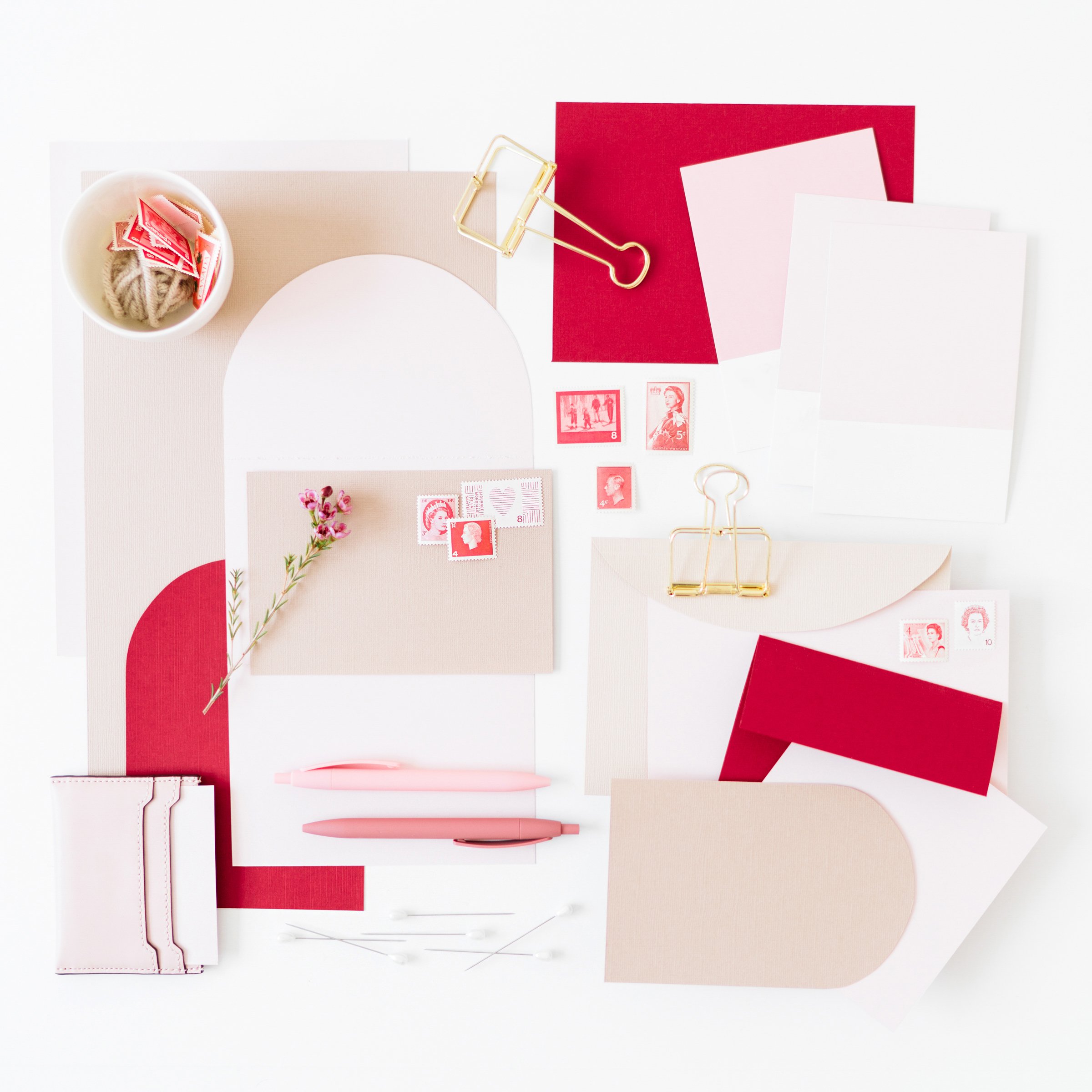
I am inspired by all of the unique and artistically-done envelope calligraphy that I see artists designing. I love all of the swoops, the illustrations, and the divergence from the ordinary. My question is regarding USPS: how legible does envelope calligraphy need to be in order for the USPS to process it? Would it be “pressing the envelope” of USPS processing standards, to address an envelope vertically (for example) verses horizontally, and then send it off in the mail? I would love to use these fun techniques, but I have been wondering how the Post Office feels about such things… -Sarah of Plumeria Paperie
[36:10] Elisabeth It’s like winning the lottery. Sometimes I will say, I know that if you like intentionally address something vertically, they will. Charge you for a non machine double charge. So you would need a forever stamp plus the additional 20 cents or whatever it is now I can never keep track. You got exactly Sarah.
What I would say is. First of all, there are a lot better about like getting things through, then people do give them credit for, they can, the machines can read all sorts of like crazy things. I would say, as long as like the zip code is very legible. That’s very, very important. Yes. But I would say like, do some tests.
Do some tests like send some crazy, crazy fun RC envelopes to some friends, um, sent some to yourself and drop them off at a post office locally to see what happens. Um, cause you can like, you can get away from. A lot. Um, and Lindsay have the postman’s knock one of my favorite calligraphy logs. She talks about that in one of her, she has a couple blog posts, I think actually that are all about what she’s caused on envelope art, because it’s not just calligraphy.
It’s like everything under the sun divergence from the ordinary, as you said, Sarah, which I loved so much. Um, yeah, so that’s kind of my thought. Yeah, I totally agree. I think. 100%, all of that, do a lot of testing and make sure that that your especially your local post office will accept it, but also like send it to some people across the country and see how their post offices do.

+ show Comments
- Hide Comments
add a comment